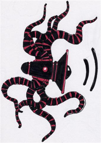
I like where this is going but as a logo I have a comment that you might take into consideration if you continue to work it. A logo is like a compact sculpture so you can apply to it what Picasso (or someone) said about its composition, that it should look like it can roll down a mountain with no parts breaking off. I feel like there are parts of this sketch that could break off. If there was a way to tighten it up at all I think it will be very sucessful.
1 comment:
I like where this is going but as a logo I have a comment that you might take into consideration if you continue to work it. A logo is like a compact sculpture so you can apply to it what Picasso (or someone) said about its composition, that it should look like it can roll down a mountain with no parts breaking off. I feel like there are parts of this sketch that could break off. If there was a way to tighten it up at all I think it will be very sucessful.
Post a Comment